dinsdag 4 maart 2014

'My secret place'.........


Hi there,

Today my creation with one of the lovely new castles from the 'Fantasy Castles'. These stamps are great to colour and to visualize your own 'magical' place! I've made this one on soft blue Basic Grey scrap paper.
I've stamped with shades of blue and green Memento inks and coloured with my Derwent Soft Colour and added gold accents on the minarets with Viva Maya gold paint.

Hallo allemaal,

Vandaag mijn creatie met de mooie nieuwe kastelen van de 'Fantasy Castles' van Chocolate Baroque. Deze stempels zijn weer heerlijk om te kleuren en om je eigen magische plek te visualiseren! Ik heb deze gemaakt op zacht blauw Basic Grey scrap papier.
Ik heb gestempeld met blauwe en groene tinten Memento inkt en gekleurd met Derwent Soft Colour en accenten op de koepels met Viva Decor Maya gold verf. (te koop bij Doe@Ding)


And of course there are lots of great CB sheets which matches perfectly with these stamps. So to frame this lovely castle I've used also 'Wisteria Lane' and Spring Foliage and my favorite feathered leaf from the 'September Fairy'.

En natuurlijk zijn ze ook weer te combineren met diverse van de CB sheets die er perfect bij passen! Dus om het kasteel in een mooi frame te zetten heb ik ook gebruikt: Wisteria Lane' and Spring Foliage en mijn favoriete varen blad van de 'September Fairy'.

Well, hope to have inspired you and appealed to your imagination to create your own 'magical' place with these stamps.Also beautiful to work with in an Art Journal( hopefully I will create one in this lifetime)

Thanks for your visit, your comment is always appreciated and hope to see you next time.
 Zo, hoop jullie weer geïnspireerd te hebben en een beroep te hebben gedaan om je eigen 'magische'plek te creëren met deze stempels.......ook prachtig in een Art Journal( waar ik hopelijk ooit nog eens aan toe ga komen)


zaterdag 8 februari 2014

Mackintosh designs on Gelli-plate backgrounds.......


Hi there,

More Mackintosh creations.......this time on the last two Gelli-print backgrounds I've had in my stash. I've got to go create more Gelli-prints now...... I've made the 'lady' panel from the Mackintosh windows sheet with the Wow Verdigris emboss.powder and also used some Wow copper . I've coloured her with waterbased markers. As you can see I've filled some areas with an embossingmarker and copper emboss.powder. 

Hallo daar,

Nog wat Mackintosh creaties......deze keer op de laatste twee Gelli-plate achtergronden die ik nog had in m'n voorraad. Dus ik moet weer aan de slag met de GP......Ik heb het paneel met de vrouw van de Mackintosh windows sheet  met Wow Verdigris embossingpoeder gemaakt en ook wat Wow koper gebruikt. Ik heb gekleurd met Tombo's. Zoals je kunt zien heb ik enkele delen van het paneel bewerkt met een embossingmarker en koper embossing.

Mackintosh Windows Unmounted Rubber stamp sheet - A5


and a closer look.........

even wat dichterbij......


The 2nd card also on the Gelli-plate background. Embossed with silver and coloured with waterbased markers. I've added a Memorybox die and some rolled rosed from Dynamics.

De tweede kaart ook weer op de GP achtergrond. Geembosst met zilver en gekleurd met de Tombo's. Hierbij heb ik een Memoryboxmal gebruikt en de 'rolled roses' mal van Dynamics.


I've added also some Inca Gold silver on the Memorybox die cut.......
Ik heb nog wat Inca Gold zilver op de Memorybox hoek verwerkt......

When you want to see more of my 'Mackintosh' creations please hop over to the DT blog.......I've published two other cards there.......

Als je nog meer wilt zien van mijn 'Mackintosh' creaties, neem dan een kijkje op het DT blog, daar staan er nog twee........


Thanks for your visit, always appreciate your comments!
Till next time,

Bedankt voor je bezoek, waardeer je reactie altijd en
tot de volgende keer,


maandag 3 februari 2014

Mackintosh beauty in blue shades.....


Hello there,

(this post is also published on the DT blog)
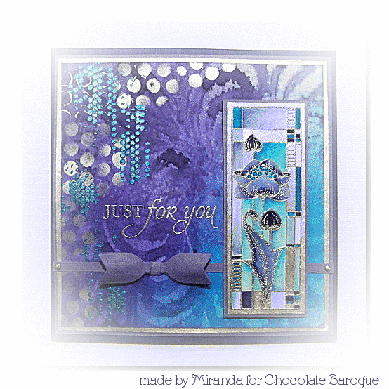
I like the Art Nouveau style very much so these stamps appeal to my imagination. I've made two cards in the same colour combination, different kind of blues and silver.

Hallo lieve mensen,

(deze post is ook gepubliceerd op het DT blog)

Ik hou van Art Nouveau dus deze stempels deden een beroep op mijn fantasie. Ik heb twee kaarten gemaakt in dezelfde kleuren combinatie verschillende tinten blauw en zilver.


The first one is a 4 fold card which I've cut diagonal and a lot of space to decorate...... I've embossed the panel with Wow blue lagoon and coloured with waterbased markers and added some silver ink. I've made a collage of some sentiments of the 'Amazing Birthday' sheet and stamped, coloured and decoupaged the flower from the same panel. I've used the 'Mackintosh Beauty'sheet.

De eerste is een gevouwen kaart die schuin is afgesneden met veel ruimte om te vullen........Ik heb het paneel geembosst met Wow Blue lagoon en gekleurd met markers op waterbasis en nog wat zilverkleurige inkt. Ik heb een collage gemaakt van sommige teksten van de 'Amazing Birthday' sheet en de bloem van hetzelfde paneel extra gestempeld, gekleurd en uitgeknipt. Ik heb hier de 'Mackintosh Beauty' sheet gebruikt.


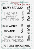
Than on to the 2nd one.......created with almost the same colour combination only this time I've made a background using Distress inks and a mask.I've added texture with the Viva decor Inca Gold,using the colours silver and turkoois. The bow is a Dynamics die and the sentiment is from the 'Amazing Birthday' sheet. This time embossed with silver and  using the same water based markers.

Dan door naar de 2e.......bijna dezelfde kleuren alleen deze achtergrond is gemaakt Distress inkten en een masker. Hierna heb ik met Inca Gold de textuur aangebracht, dit keer met zilver en turqoise. De strik is een Dynamics snijmal(Doe@Ding) en de tekst is weer van de 'Amazing Birthday'sheet. Deze keer geembosst met zilver en gekleurd met dezelfde markers.


a close-up of the texture......

een close-up van de textuur....


Well, stay tuned and watch for more beautiful art work made by the talented ladies of this team!
Zo, blijf afgestemd op.....en kijk uit naar meer mooi werk gemaakt door de getalenteerde dames van het team!

Thanks for visiting and hope to 'see' you next time,
Bedankt voor je bezoek en hoop je weer te 'zien',


vrijdag 31 januari 2014

New stamps Chocolate Baroque...a la Mackintosh.......


Hello there,

Chocolate Baroque has just launched new stamp sheets, they are called 'Mackintosh beauty', ' Mackintosh windows' and a clear word text sheet that has a matching font, 'Mackintosh sentiments'. They are also available in a multi-buy if you could not choose....... If you look on Pinterest you can  find several artwork of Charles Rennie Mackintosh and his wife Margaret.


http://www.chocolatebaroque.com/Mackintosh-WindowsMackintosh-Beauty-Unmounted-Rubber-stamps-Multi-buy--A5-_p_5813.html#http://www.chocolatebaroque.com/Mackintosh-Sentiments-Unmounted-Clear-stamp-set_p_5817.html
Hallo allemaal,

Chocolate Baroque heeft pas nieuwe stempelsheets gelanceerd en ze hebben de mooie naam; 'Mackintosh beauty', 'Mackintosh windows' en een clear tekst sheet dat een bijpassend lettertype heeft, 'Mackintosh sentiments'. Ze zijn ook weer verkrijgbaar als multi-koop als je niet kunt kiezen......Als je op Pinterest kijkt kun je diverse kunstwerken vinden van Charles Rennie Mackintosh en zijn vrouw Margaret.


When I saw this die in a craftshop I thought it would be a perfect match with these stamps. I stamped on Basic Grey paper and coloured the panel with pecils and a white gelly pen. Just added some dewdrops and I've decorated the inside also with the same die, only reversed the colours.......The sentiment is from the 'Amazing Birthday'sentiments.


Toen ik deze snijmal zag in een hobbywinkel dacht ik dat hij er perfect bij zou passen. Ik heb gestempeld op Basic Grey papier en het paneel gekleurd met kleurpotloden en witte gelpen. Allen wat dewdrops erbij en ik heb dit keer de binnenkant van de kaart ook gedecoreerd met dezelfde mal, alleen de kleuren gewisseld.....
De tekst is van de 'Amazing Birthday' sentiments.


The 2nd card.......... made on a water coloured background with Distress inks and using a mask. I've embossed the panel and rosed with Wow Black glint and coloured it with waterbased markers. 

De tweede kaart.....gemaakt op aquarel papier met Distress inkten en een masker. Ik heb het paneel en de rozen geembosst met Wow Black glint en gekleurd met markers op waterbasis.

Don't forget to look at the DT blog and the blogs of my teammembers, lots of inspirational work to see!

Vergeet niet een kijkje te nemen op het DT blog en de blogs van mijn teammaatjes, veel inspirerend werk te zien daar!

Hope to see you next time and enjoy your day!
Hoop je volgende keer weer te zien en geniet van de dag!


donderdag 16 januari 2014

Pan Pastel creations with Magenta.....


(Voor de Nederlandse vertaling zie het eerder geplaatste bericht hier:)
http://panpastelbnl.blogspot.nl/2014/01/pan-pastels-with-magenta.html

Hi there,

At first I want to wish everybody a wonderful, healthy and creative 2014!

I've made two Pan Pastel creations with a lovely flower stamp from Magenta and some cover a cards from Impression Obsession. I've used a structured canvas paper with a rough and less rough side. I am happy that the velvet paper is back in the collection but this canvas paper is also great to work on.
On the background I've used partially cover a card French script. The flower is also embossed with Wow silver pearl. You can see the effect in the close-up pic.
For the two rectangles I've used the rough side of the paper and I've used the other side for the background.


You can see the structure of the paper through the embossing layers.

Pan Pastels card 1:

Ultramarine blue tint 520.8/Blue shade 520.3/extra dark 520.1
Violet tint 470.8
Magenta tint 430.8
Stamps:
IO cover a card French script
Magenta flower trio

WOW embossingpoeder Silver pearl 
Versamark

And the 2nd card with different colours and more cover a card backgrounds, Grunge and Spatter. The flowers are stamped with Hero arts inks with different shades of grey and black. I've used the less rough side for the rectangles and for the background I've used the 'velvet' paper. This is such a great surface to work on........


Pan Pastels:

Phtalo green tint 620.8/620.5/620.3
Violet tint 470.8/470.5/470.3

inks:
Versamark
Heroarts midtones Charcoal/Soft Granite
Versafine black

Stamps:
IO cover a cards: 
Grunge/French script/Spatter
Magenta flower trio
Magenta quote

Well. I hope to inspire you a lot more this coming year and just take out your Pan Pastels and have a play! You don't have to want a perfect result right a way........just by experimenting and doing you will find your own way......just explore.....
If you like a special technique of style, just let me know......

till next time and thanks for your visit,
always a joy to read your comments


zaterdag 11 januari 2014

Buddha and Lotus a la Monet..........


 Hi there,

Today two cards made with the new Buddha sheets from Chocolate Baroque. You already know they are up to my street, they are so lovely to play with........ When I've used a Crafters stencil on the background stamped and coloured the images....I thought it looked a bit like the paintings of Monet......just a little bit.....I've used a great product, Crystal gel hologram from Viva Decor. It's a transparant gel with glitter and pieces of mica and it has a lovely sparkly shine. I've used one of my fav Crafters stencils 'Cell theory'


Hallo allemaal,

Vandaag  nog twee kaarten met de nieuwe Boeddha sheets van Chocolate Baroque. Jullie weten al dat ze precies in mijn 'straatje'zijn, ze zijn heerlijk om mee te spelen.......Toen ik een Crafters stencil voor de achtergrond gebruikt had , gestempeld en gekleurd had......vond ik het wel een beetje op de schilder stijl van Monet lijken.......een beetje maar hoor.......Ook heb ik hier de gave kristalgel van Viva decor in gebruikt. Ook weer met hetzelfde Crafters stencil, een van m'n favorieten.......'.Cell theory'
Cell Theory


And the 2nd card, also made on a background with the acrylic bloc technique using the same stencil and Viva Decor Kristall gel. I've used also some of the lovely Memorybox dies. 

En de tweede kaart, ook gemaakt op een achtergrond met de acrylblok techniek, hetzelfde stencil en de Viva Decor Kristall gel. Ik heb hier ook wat van de mooie Memorybox mallen bij gebruikt.

For a better view at the structure of the Viva Crystal gel......doesn't it have a great sparkly effect?
Hier zie je duidelijk de mooie structuur van de Viva Kristal gel. hologram.....heeft het geen mooi sparkly effect?(ook bij Doe@Ding)


May your day sparkle too! Thanks for visiting......

Dat jouw dag ook maar mag sprankelen! Bedankt voor je bezoek.......


vrijdag 3 januari 2014

Wishing you a peaceful 2014! Een vredig 2014 wens ik jullie..........


Hi there,

This is my first blog post in the new year and first of all I wanted to wish you a peaceful and healthy 2014! You will need some time to read this blog post because there is a lot writing.....so I hope that 'patience' is something to work with in 2014...LOL
I've just been reading several blog posts of inspirational people and it got me in a contemplative mood. What are my goals for 2014........well I have had several the last year and did think and dream a lot of them but there was not much action.........I also realize that I have a very big 'Inner critic' because I also did create two new books and it was a lot of work and there were a lot of workshops and DT work......some translation work and also having a family with all problems that can be related to that.......and a house that needs to be cleaned up and get more structure in a chaos which it is now.......

So I have to be a bit milder to myself and put that 'Inner critic' to the background! So I have some goals on short terms and some on longer terms....I will write them down on a list for myself to put the energy down in words and start to make them come alive, I have a text stamp that says'Wish it, dream it and DO it and the last part is important for me.....to get some MOVEMENT in the widest sense of that word!

I've published already two of the new creations with the new Buddha stamps of Chocolate Baroque. They are called 'Serenity' and 'Tranquility'. They are just up to my street as I love Buddha's! Here is the link of that blogpost on the DT blog and a sneakpeak....just hop over for a moment and you can also enjoy the lovely work of my teamies there!
http://chocolatebaroque.blogspot.nl/2013/12/buddha-creations-by-miranda.html


Hallo lieve mensen,

Dit is mijn eerste blogpost voor 2014 en wil jullie eerst een vredig en gezond 2014 wensen! Voor deze blogpost heb je wat meer tijd nodig want ik heb wel het een en ander geschreven.....dus ik hoop dat 'GEDULD'  is iets om wat mee te doen in 2014....LOL
Ik heb zojuist wat blogposten gelezen van mensen die mij inspireren en het heeft me in een beschouwende stemming gebracht(voor zover ik dat al niet was) Wat zijn mijn doelen voor 2014.......ja, ik heb er diversen gehad in de afgelopen jaren en heb veel gedacht en gedroomd .....maar er niet zo veel mee gedaan....ik realiseer me ook dat ik een sterke 'innerlijke criticus' heb omdat ik ook twee boekjes heb geschreven die veel tijd en energie kostten en er waren natuurlijk de nodige workshops en DT werkzaamheden, wat vertaalwerk ook familie die aanverwante 'problemen' met zich meebrengen, een huis dat nodig schoongemaakt en opgeruimd moet worden om enigszins structuur in chaos te scheppen..........

Dus mag ik wel wat milder zijn naar mezelf  en de innerlijke criticus wat meer naar de achtergrond schuiven. Dus heb ik wat doelen voor de korte termijn en wat voor de langere termijn........ik schrijf ze op een lijst voor mezelf om de energie neer te zetten en vorm te geven.....Ik heb eeb tekst stempel die het mooi verwoord....Wish it, dream it, DO it! En vooral dat laatste is belangrijk voor me......MEER IN BEWEGING KOMEN in de breedste zin van het woord.

Inmiddels heb ik al twee creaties met de nieuwe stempel sheets van Chocolate Baroque op het DT blog geplaatst. Hier is de link en een sneakpeak (zie boven) dus hop even over naar het DT blog en geniet ook van de mooie creaties van mijn teammaatjes daar!

And now on to the new creations with these gorgeous sheets.....can you imagine


 how to use them with Art-journaling too?

En nu naar de andere creaties met deze prachtige sheets......
Kun je je voorstellen hoe mooi je ze kunt verwerken in een Art-Journal? Ook daar wil ik mee beginnen in 2014........

To show you the 1st and 2nd stage of this work....here they are
Om je de eerste laag en tweede te laten zien....hier zijn ze


and the final piece......
en het uiteindelijke resultaat......


I've created this one using both the 'Tranquility and Serenity'sheet and worked her on a background of Distress inks using the acrylic bloc technique.Also used the loveley Waterlily stamps with it. I've stamped with a light coloured ink and coloured with pencils.  I've used an embossingfolder and some pearls on the left-side, because my 'Inner decorator' is very strong LOL.....and wants to play

Ik heb deze kaart gemaakt met beide nieuwe sheets Tranquility and Serenity' en verwerkt op een achtergrond gemaakt met de acrylblok techniek en Distress inkten. Ook de Water lelie stempel van CB heb ik erbij gebruikt. Ik heb met een lichte inkt gestempeld en gekleurd met kleurpotloden.Ik heb hier ook een embossingmal gebruikt en wat parels, omdat mijn 'innerlijke decorateur' ook sterk is en wat wil spelen....LOL


The 2nd one has been made using some Memorybox/Poppystamps dies which are so beautiful! I've used the gothic window twice for the front and inside of the card and put some acetate in between. Also used the pine cone branch corner which is a beautie.....

De tweede is gemaakt met diverse Memorybox/Poppystamps mallen, ik vind ze nog steed erg mooi! Ik heb het gothische raam 2x gebruikt aan de voor en binnenzijde en tussenin wat mica sheet. Ook de denne appel tak hoek is zo mooi......Doe @Ding heeft ze nog in de collectie....


On the front I've stamped one of the Gothic elements from CB........ one of my favorite texture sheets.....
Op de voorkant heb ik een van de Gothic elements van CB........ gestmpeld....een van mijn favorieten onder de textuur stempels......


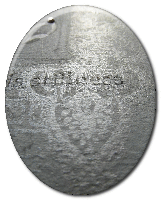
On the inside I've used the lovely tree from the Tranquility sheet embossed in white on scrap paper from the Prima FIREFLY collection and added several layers of Pan Pastels using the branches of the tree,you can see them here. Also used some of the Chunky white embossing of Stampendous.

Op de binnenzijde heb ik de mooie boom met wit geembosst op scrap papier van Prima(Firefly) en heb diverse lagen Pan Pastel aangebracht hierbij de takken van de boom gebruikt. Je ziet het hier op het ovaal. Ook heb ik de Chunky white embossing enamel van Stampendous gebruikt. Anita Izendoorn is hier ook een grote fan van en gebruikt het vaak met nog meer andere produkten van Stampendous op haar mooie creaties. Neem eens een kijkje op haar blog voor zover je daar nog niet bent geweest.


Inside of card with the lovely serene tree. and layers of Pan Pastel and soft toned inks........I've only added the quote to keep it serene


I am working on more samples and hope to show them soon to you!

Ik ben met meer voorbeelden bezig en hoop ze gauw te laten zien!

Creative greetz,


' DANCE'

While I dance I cannot judge,
I cannot hate, I cannot separate myself from life.
I can only be joyful and whole.
That is why I dance.”
~Hans Bos