


Hello there,
Today I want to share the cards made for the WOW workshop at the Posthumus shop in Amsterdam. We've used a lot of WOW powders and at the end of the day we had a very sparkly floor and a lot of fun! They could choose out of 5 themes and colour combi's, there was;
Colourful India
Vibrant India
Peacock Glam
Perfect Paisley
Seabreeze
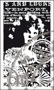
Warm earth
Vandaag wil ik jullie de kaarten laten zien die gemaakt zijn voor de WOW workshop bij de Posthumus winkel in Amsterdam. Het was weer gezellig en de mensen waren enthousiast. We hebben een heleboel embossing poeders gebruikt en aan het eind van de dag hadden we dan ook een zeer glinsterende vloer en veel plezier!
De mensen konden kiezen uit 5 thema's en kleuren combi's, zie bovenstaande
Here is the first one..........made on pink paper with the WOW colours;
Hier is de eerste......gemaakt op roze papier met de volgende WOW kleuren;
Primary Mandarin
Fluor Tickled pink
Magical Mauve glitter
Princess Pink
made with the Indian stamps of Chocolate Baroque, the main image is stamped with black and coloured with pencils. Some white highlights with a gelli pen and as you maybe have noticed the edges of the card are embossed too. This multi colouring technique requires focus, patience and precision.......you can imagine what it would be like to put the powder in the jar of another colour.......oooh
gemaakt met de the Indian stamps van Chocolate Baroque, de kleine afbeelding is gestempeld met zwart en ingekleurd met potloden. Wat highlights met witte pen en misschien heb je het gezien, de randen van de ondergrond zijn ook geembosst.
Deze veel kleurige embossing techniek vereist concentratie, geduld en zorgvuldigheid.....je kunt je voorstellen hoe het zou zijn als de poeders in een verkeerd potje worden terug gedaan ....oeps

here a close-up of the beautiful sparkly embossing layers.....
hier een close-up van de mooie sprankelende embossing lagen.....

Here is card no.2........on a beautiful yellow ochre card
used EP's:
Primary Mandarin
Red glitz
Magical Mauve
En hier kaart no. 2.......op een mooie okergele kaart


And no. 3.......made on a spicy orange colour
and WOW EP;
Fluor Tickled pink
Red Glitz
Pearl Gold sparkle
En nr. 3 .......op een spicy oranje kleur


And the 2nd batch of the 'Peacock Glam' cards.......
En de 2e serie van de 'Peacock Glam' kaarten......
WOW EP :
Brass
Green glitz
Blue Glitz
Blue blast
Stamps from Impression Obsession;

and a close-up......
en een close-up.....

.And the 2nd card......with use of the same colours EP but on a coloured card
En de 2e kaart.......met gebruik van de zelfde kleuren EP maar op een gekleurde kaart

close-up

The peacock feather on this card is stamped with Versamark and Black soot Distress ink, than sprinkled with WOW Neutral Ultra shimmer.
De pauwenveer op dit kaartje is gestempeld met Versamark en Black soot distress inkt, dan bestrooid met WOW Neutral Ultra shimmer en geembosst
Alle gebruikte WOW poeders zijn te koop bij de Posthumuswinkel evenals de gebruikte stempels.
Next time I will show you the other workshop cards,
see you soon,
Volgende keer de andere workshop kaarten,
tot gauw,


 Magenta tint/colour/shade

